Diff-in-Diff notebook
In this section we are going to look at the diff-in-diff estimator. We consider two periods and two groups where one group recieves a treatment D in the second period.
We consider an outcome variable of interest Y.
TODO: add defintion for each acronym
import numpy as np
import pandas as pd
import seaborn as sns
%matplotlib inline
from ipywidgets import interactive
import matplotlib.pyplot as plt
N = 5000
mean = [0, 0.25, 1.0]
rho1 = 0
rho2 = 0
rho3 = 0
cov = [[1, rho1, rho2], [rho1,1,rho3],[rho2,rho3,1] ] # diagonal covariance
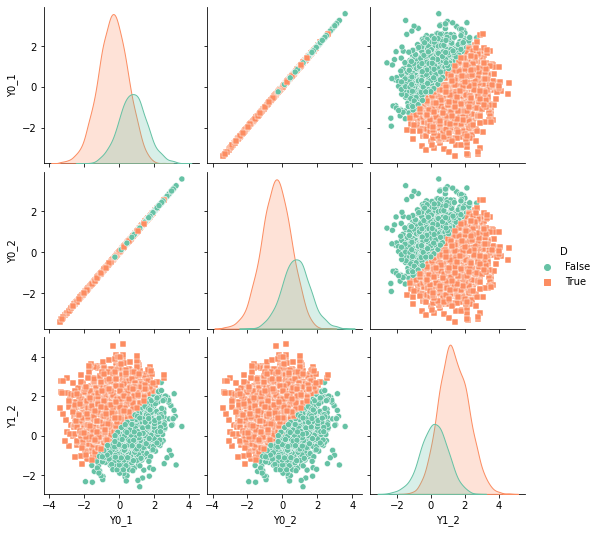
Y0_1, Y0_2, Y1_2 = np.random.multivariate_normal(mean, cov, N).T
df = pd.DataFrame({"Y0_1":Y0_1,"Y0_2":Y0_2, "Y1_2":Y1_2})
sns.pairplot(df, kind="scatter")
plt.show()
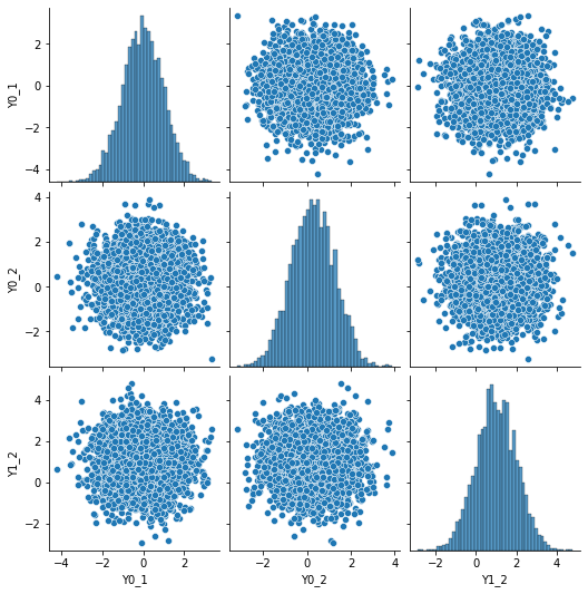
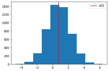
# we are interested in the full distribution of (Y1,Y0) but of course the mean difference is already interesting. We refer to
# at the ATE

plt.hist(df['Y1_2']-df['Y0_2'])
plt.axvline( (df['Y1_2']-df['Y0_2']).mean() , color="red", label="ATE")
plt.legend()
plt.show()
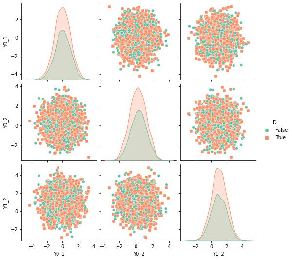
A/B testing - Randomized treatment
We assume that we randomly assigned the treatment to individuals. In this case we have
as well as
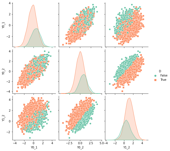
D = np.random.uniform(size=N)>0.4
df['D'] = D

sns.pairplot(df, kind="scatter", hue="D", markers=["o", "s"], palette="Set2")
plt.show()
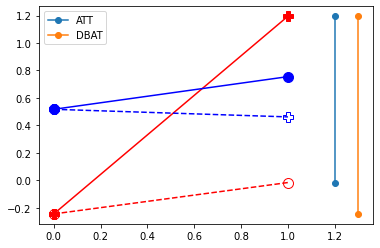
plt.plot( [df.query("D==1")['Y0_1'].mean(),df.query("D==1")['Y0_2'].mean()] , '-o', markersize=10,color="red", linestyle="--", fillstyle="none")
plt.plot( [df.query("D==1")['Y0_1'].mean(),df.query("D==1")['Y1_2'].mean()] , '-P', markersize=10,color="red",label="T")
plt.plot( [df.query("D==0")['Y0_1'].mean(),df.query("D==0")['Y0_2'].mean()] , '-o', markersize=10,color="blue",label="C")
plt.plot( [df.query("D==0")['Y0_1'].mean(),df.query("D==0")['Y1_2'].mean()] , '-P', markersize=10,color="blue", linestyle="--", fillstyle="none")
plt.legend()
plt.show()
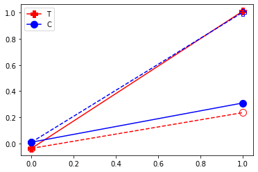
Note that in this case we can read off the ATT by differencing the control and treatment. A before after comparaison wrongly assign a lot of the effect to the time trend!
def compute_TE(df):
res1 = {}
res1['ATE'] = df.eval('Y1_2 - Y0_2').mean()
res1['ATT'] = df.query('D==1').eval('Y1_2 - Y0_2').mean()
res1['ATC'] = df.query('D==0').eval('Y1_2 - Y0_2').mean()
res2 = {}
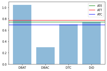
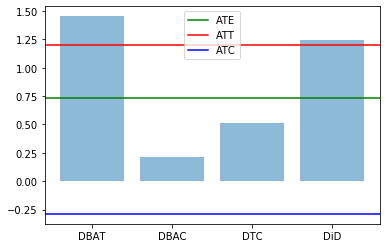
res2['DBAT'] = df.query('D==1').eval('Y1_2 - Y0_1').mean()
res2['DBAC'] = df.query('D==0').eval('Y0_2 - Y0_1').mean()
res2['DTC'] = df.query('D==1').eval('Y1_2').mean() - df.query('D==0').eval('Y0_2').mean()
res2['DiD'] = res2['DBAT'] - res2['DBAC']
return(res1,res2)
res0,res1 = compute_TE(df)
plt.bar(range(len(res1)), res1.values(), align='center', alpha=0.5)
plt.xticks(range(len(res1)), res1.keys())
plt.axhline(res0['ATE'],label='ATE',color="green")
plt.axhline(res0['ATT'],label='ATT',color="red")
plt.axhline(res0['ATC'],label='ATC',color="blue")
plt.legend()
plt.show()
Before - After
Consider instead a case where the treatment is not assigned randomly. For instance imagine that there is a fixed cost to taking the treatment and that each agent chooses individualy whether to take the treatment.
We then
- introduce a selection rule into treatment D_i = 1[ Y_2(1) - Y_1(0) > c ]
- we impose Y_1(0)=Y_2(0) (not trend and perfect correlation)
We remember that for the before-after approach to be valid, we need that
E[ Y_2(0) | D {=} 1] = E[ Y_1(0) | D {=} 1]
By having perfect correlation between Y_1(0) and Y_2(0) we guarantee such outcome. In other words here, the period 1 outcome is a perfect measurement of the non-treated outcome.
mean = [0, 0, 1.0]  # no trend effect
rho1 = 1; rho2 = 0; rho3 = 0 # perfect correlation between Y0_1 and Y0_2
cov = [[1, rho1, rho2], [rho1,1,rho3],[rho2,rho3,1] ]  # diagonal covariance
Y0_1, Y0_2, Y1_2 = np.random.multivariate_normal(mean, cov, N).T
df = pd.DataFrame({"Y0_1":Y0_1,"Y0_2":Y0_2, "Y1_2":Y1_2})

# Note the change in the decision rule here
df['D'] = df['Y1_2'] - df['Y0_2'] - 0.3 > 0
sns.pairplot(df, kind="scatter", hue="D", markers=["o", "s"], palette="Set2")
plt.show()
plt.plot( [df.query("D==1")['Y0_1'].mean(),df.query("D==1")['Y0_2'].mean()] , '-o', markersize=10,color="red", linestyle="--", fillstyle="none")
plt.plot( [df.query("D==1")['Y0_1'].mean(),df.query("D==1")['Y1_2'].mean()] , '-P', markersize=10,color="red",label="T")
plt.plot( [df.query("D==0")['Y0_1'].mean(),df.query("D==0")['Y0_2'].mean()] , '-o', markersize=10,color="blue",label="C")
plt.plot( [df.query("D==0")['Y0_1'].mean(),df.query("D==0")['Y1_2'].mean()] , '-P', markersize=10,color="blue", linestyle="--", fillstyle="none")
plt.legend()
plt.show()
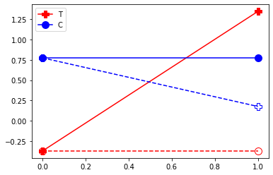
Here we see that we can look at the before/after to check the ATT and the AT. Again, because we have constructed the non treated outcome to be the same in period 1 and 2, hence the before/after gives us the treatment effect.
res0,res1 = compute_TE(df)
plt.bar(range(len(res1)), res1.values(), align='center', alpha=0.5)
plt.xticks(range(len(res1)), res1.keys())
plt.axhline(res0['ATE'],label='ATE',color="green")
plt.axhline(res0['ATT'],label='ATT',color="red")
plt.axhline(res0['ATC'],label='ATC',color="blue")
plt.legend()

plt.show()

Difference in Difference
We know add: - trend - covariance between all outcomes
We however maintain an important assumption which is the common trend assumption. This happens by imposing that the gain is orthogonal the time effect of the non treated outcome.
mean = [0, 0.25, 1.0]
rho1 = 0.7 # between Y0_1 and Y0_2
rho2 = 0.3 # between Y0_1 and Y1_2
rho3 = 1+rho2 - rho1 # between Y1_2 and Y0_2 - this is what makes the DiD work
cov = [[1, rho1, rho2], [rho1,1,rho3],[rho2,rho3,1] ]  # diagonal covariance
Y0_1, Y0_2, Y1_2 = np.random.multivariate_normal(mean, cov, N).T
df = pd.DataFrame({"Y0_1":Y0_1,"Y0_2":Y0_2, "Y1_2":Y1_2})

df['D'] = df['Y1_2'] - df['Y0_2'] - 0.3 > 0
sns.pairplot(df, kind="scatter", hue="D", markers=["o", "s"], palette="Set2")
plt.show()
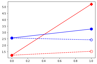
plt.plot( [df.query("D==1")['Y0_1'].mean(),df.query("D==1")['Y0_2'].mean()] , '-o', markersize=10,color="red", linestyle="--", fillstyle="none")
plt.plot( [df.query("D==1")['Y0_1'].mean(),df.query("D==1")['Y1_2'].mean()] , '-P', markersize=10,color="red")
plt.plot( [df.query("D==0")['Y0_1'].mean(),df.query("D==0")['Y0_2'].mean()] , '-o', markersize=10,color="blue")
plt.plot( [df.query("D==0")['Y0_1'].mean(),df.query("D==0")['Y1_2'].mean()] , '-P', markersize=10,color="blue", linestyle="--", fillstyle="none")

plt.plot( [1.2,1.2], [ df.query("D==1").eval('Y0_2').mean(), df.query("D==1").eval('Y1_2').mean()] ,'-o', label="ATT")
plt.plot( [1.3,1.3], [ df.query("D==1").eval('Y0_1').mean(), df.query("D==1").eval('Y1_2').mean()] ,'-o', label="DBAT")
plt.legend()
plt.show()
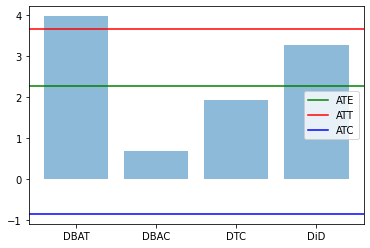
res0,res1 = compute_TE(df)
plt.bar(range(len(res1)), res1.values(), align='center', alpha=0.5)
plt.xticks(range(len(res1)), res1.keys())
plt.axhline(res0['ATE'],label='ATE',color="green")
plt.axhline(res0['ATT'],label='ATT',color="red")
plt.axhline(res0['ATC'],label='ATC',color="blue")
plt.legend()

plt.show()
Effect of non-linear change
We make a simple transformation on the outcome variable: \exp (Y).
for v in ['Y0_1','Y1_2','Y0_2']:
    df[v] = np.exp(df[v])
plt.plot( [df.query("D==1")['Y0_1'].mean(),df.query("D==1")['Y0_2'].mean()] , '-o', markersize=10,color="red", linestyle="--", fillstyle="none")
plt.plot( [df.query("D==1")['Y0_1'].mean(),df.query("D==1")['Y1_2'].mean()] , '-P', markersize=10,color="red")
plt.plot( [df.query("D==0")['Y0_1'].mean(),df.query("D==0")['Y0_2'].mean()] , '-o', markersize=10,color="blue")
plt.plot( [df.query("D==0")['Y0_1'].mean(),df.query("D==0")['Y1_2'].mean()] , '-P', markersize=10,color="blue", linestyle="--", fillstyle="none")
[<matplotlib.lines.Line2D at 0x7fad746ad640>]
res0,res1 = compute_TE(df)
plt.bar(range(len(res1)), res1.values(), align='center', alpha=0.5)
plt.xticks(range(len(res1)), res1.keys())
plt.axhline(res0['ATE'],label='ATE',color="green")
plt.axhline(res0['ATT'],label='ATT',color="red")
plt.axhline(res0['ATC'],label='ATC',color="blue")
plt.legend()

plt.show()
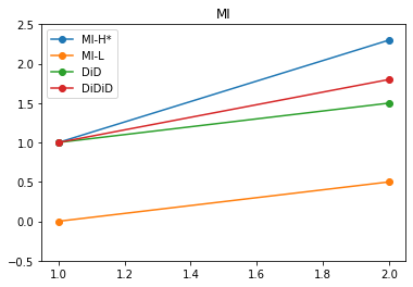
Difference in Difference in Difference
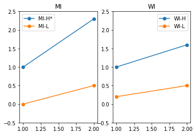
# we generate a policy change in one state for one age group
# we end up with 8 observed values

# Michigan disability increase for high earners
# looking at time on disability

# Michigan High earners
Y_H_S1_T1 = 1
Y_H_S1_T2 = 2.3

# Michigan low earners
Y_L_S1_T1 = 0
Y_L_S1_T2 = 0.5

# Wisconsin High earners
Y_H_S2_T1 = 1
Y_H_S2_T2 = 1.6

# Wisconsin low earners
Y_L_S2_T1 = 0.2
Y_L_S2_T2 = 0.5

plt.subplot(1,2,1)
plt.plot([1,2],[Y_H_S1_T1,Y_H_S1_T2], "-o", label="MI-H*")
plt.plot([1,2],[Y_L_S1_T1,Y_L_S1_T2], "-o", label="MI-L")
plt.title("MI")
plt.ylim(-0.5,2.5)
plt.legend()

plt.subplot(1,2,2)
plt.plot([1,2],[Y_H_S2_T1,Y_H_S2_T2], "-o", label="WI-H")
plt.plot([1,2],[Y_L_S2_T1,Y_L_S2_T2], "-o", label="WI-L")
plt.title("WI")
plt.ylim(-0.5,2.5)
plt.legend()

plt.show()
plt.subplot(1,2,1)
plt.plot([1,2],[Y_H_S1_T1,Y_H_S1_T2], "-o", label="MI-H*")
plt.plot([1,2],[Y_L_S1_T1,Y_L_S1_T2], "-o", label="MI-L")
plt.plot([1,2],[Y_H_S1_T1,Y_H_S1_T1 + Y_L_S1_T2 - Y_L_S1_T1], "-o", label="DiD")
plt.title("MI")
plt.ylim(-0.5,2.5)
plt.legend()

plt.subplot(1,2,2)
plt.plot([1,2],[Y_H_S2_T1,Y_H_S2_T2], "-o", label="WI-H")
plt.plot([1,2],[Y_L_S2_T1,Y_L_S2_T2], "-o", label="WI-L")
plt.plot([1,2],[Y_H_S2_T1, Y_H_S2_T1 + Y_L_S2_T2 - Y_L_S2_T1], "-o", label="DiD")

plt.title("WI")
plt.ylim(-0.5,2.5)
plt.legend()

plt.show()
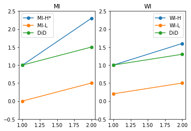
We see how that common trend is refjected on in WI. We then use WI to allow for a difference betwen H and L in trends. We take it out of MI.
DiD_WI = Y_H_S2_T1 - Y_H_S2_T1 + Y_L_S2_T2 - Y_L_S2_T1
plt.plot([1,2],[Y_H_S1_T1,Y_H_S1_T2], "-o", label="MI-H*")
plt.plot([1,2],[Y_L_S1_T1,Y_L_S1_T2], "-o", label="MI-L")
plt.plot([1,2],[Y_H_S1_T1, Y_H_S1_T1 + Y_L_S1_T2 - Y_L_S1_T1], "-o", label="DiD")
plt.plot([1,2],[Y_H_S1_T1, Y_H_S1_T1 + Y_L_S1_T2 - Y_L_S1_T1 + DiD_WI ], "-o", label="DiDiD")
plt.title("MI")
plt.ylim(-0.5,2.5)
plt.legend()
plt.show()